Analyzing single cell data: Scanpy
This past summer, I was immersed in the world of single-cell genomics - a completely new field to me. With this came learning not only how data were experimentally collected, but also how to computationally process these data.
Although much of my work was performed in Python, I dabbled a bit in the R tools for exploring single-cell RNA-seq data. As such, this will be part 1 of a two part series on basics of handling single-cell data. Here I intend to discuss some basics of Scanpy: a Python-based toolkit for handling large single-cell expression data sets.
Scanpy contains various functions for the preprocessing, visualization, clustering, trajectory inference, and differential expression testing of single-cell gene expression data. It is built jointly with AnnData which allows for simple tracking of single-cell data and associated metadata. Typically, I interface with Python and Scanpy with jupyterlab but in this post I use Rmarkdown to run Python code (see previous post if you’re curious how this is done).
Set Up
library(reticulate)
use_python('/Users/joy/miniconda3/bin/python')
Loading necessary python packages
import numpy as np
import pandas as pd
import scanpy as sc
In this post I will analyze a freely available data set from 10X genomics. This data set contains information from 2,700 single Peripheral Blood Mononuclear cells (PBMCs) that were sequenced on the Illumina NextSeq 500. You can download the raw data here.
The first step is to read the count matrix into an AnnData object – an annotated data matrix. Simply, this object stores the count matrix together with any additional slots for information about the genes (.var), cells (.obs), or anything else (.uns).

pbmc = sc.read_10x_mtx('filtered_gene_bc_matrices/hg19/',
                       var_names = 'gene_symbols',
                       cache = True)
pbmc.var_names_make_unique()
pbmc
## AnnData object with n_obs × n_vars = 2700 × 32738
##     var: 'gene_ids'
Pre-processing
Scanpy has tools for exploring quality control metrics and filtering cells based on some criteria. First I consider mitochondiral specific genes. When there is a high percentage of reads that map to the mitochondrial genome, this can indicate low-quality or dying cells. Using scanpy I can calculate the percentage of counts in mitochondrial genes and visualize this against the number of genes expressed in the count matrix as well as the total counts per cell.
pbmc.var['mt'] = pbmc.var_names.str.startswith('MT-')
sc.pp.calculate_qc_metrics(pbmc, qc_vars=['mt'], percent_top=None, log1p=False, inplace=True)
sc.pl.violin(pbmc, ['n_genes_by_counts', 'total_counts', 'pct_counts_mt'],
             jitter=0.4, multi_panel=True, size = 1.5)
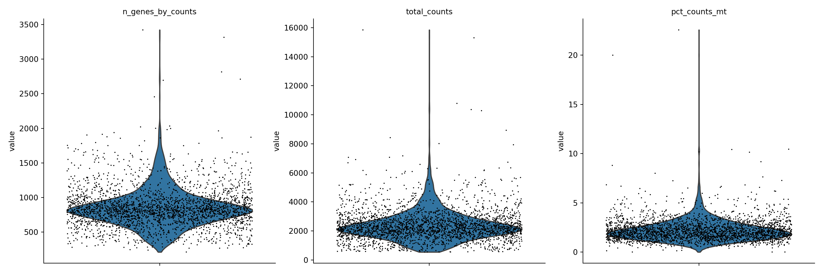
I can then filter out cells that have < 200 genes, > 2500 genes, or a mitocondrial gene count > 5%.
sc.pp.filter_cells(pbmc, min_genes = 200)
sc.pp.filter_cells(pbmc, max_genes = 2500)
pbmc = pbmc[pbmc.obs.pct_counts_mt < 5, :]
pbmc
## View of AnnData object with n_obs × n_vars = 2638 × 32738
##     obs: 'n_genes_by_counts', 'total_counts', 'total_counts_mt', 'pct_counts_mt', 'n_genes'
##     var: 'gene_ids', 'mt', 'n_cells_by_counts', 'mean_counts', 'pct_dropout_by_counts', 'total_counts'
Notice: the AnnData object now has annotations in the .obs and .var slots. These were added as a result of the calculations done above. To investigate these dataframes further, you can run:
```
pbmc.obs
pbmc.var
```
Transform data
Now that the data is filtered, the next step is normalization. Here I normalize the data matrix to 10k reads per cell. In this way, the counts become comparable among cells. Following this step, I logarithmize the data.
sc.pp.normalize_total(pbmc, target_sum=1e4)
## /Users/joy/miniconda3/lib/python3.9/site-packages/scanpy/preprocessing/_normalization.py:155: UserWarning: Revieved a view of an AnnData. Making a copy.
##   view_to_actual(adata)
sc.pp.log1p(pbmc)
Feature Selection
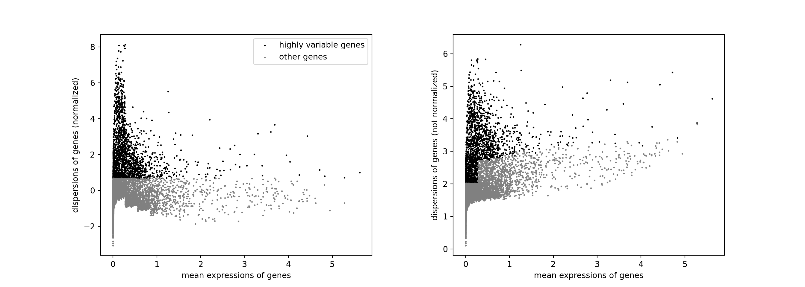
The next step is to identify highly-variable genes (HVGs).
sc.pp.highly_variable_genes(pbmc, n_top_genes = 2000)
sc.pl.highly_variable_genes(pbmc)
Scale expression
Now I regress out unwanted sources of variation – in this case, the effects of total counts per cell and the percentage of mitochondrial genes expressed. This data is then scaled.
sc.pp.regress_out(pbmc,['total_counts', 'pct_counts_mt'])
sc.pp.scale(pbmc, max_value = 10)
Dimensional Reduction: PCA
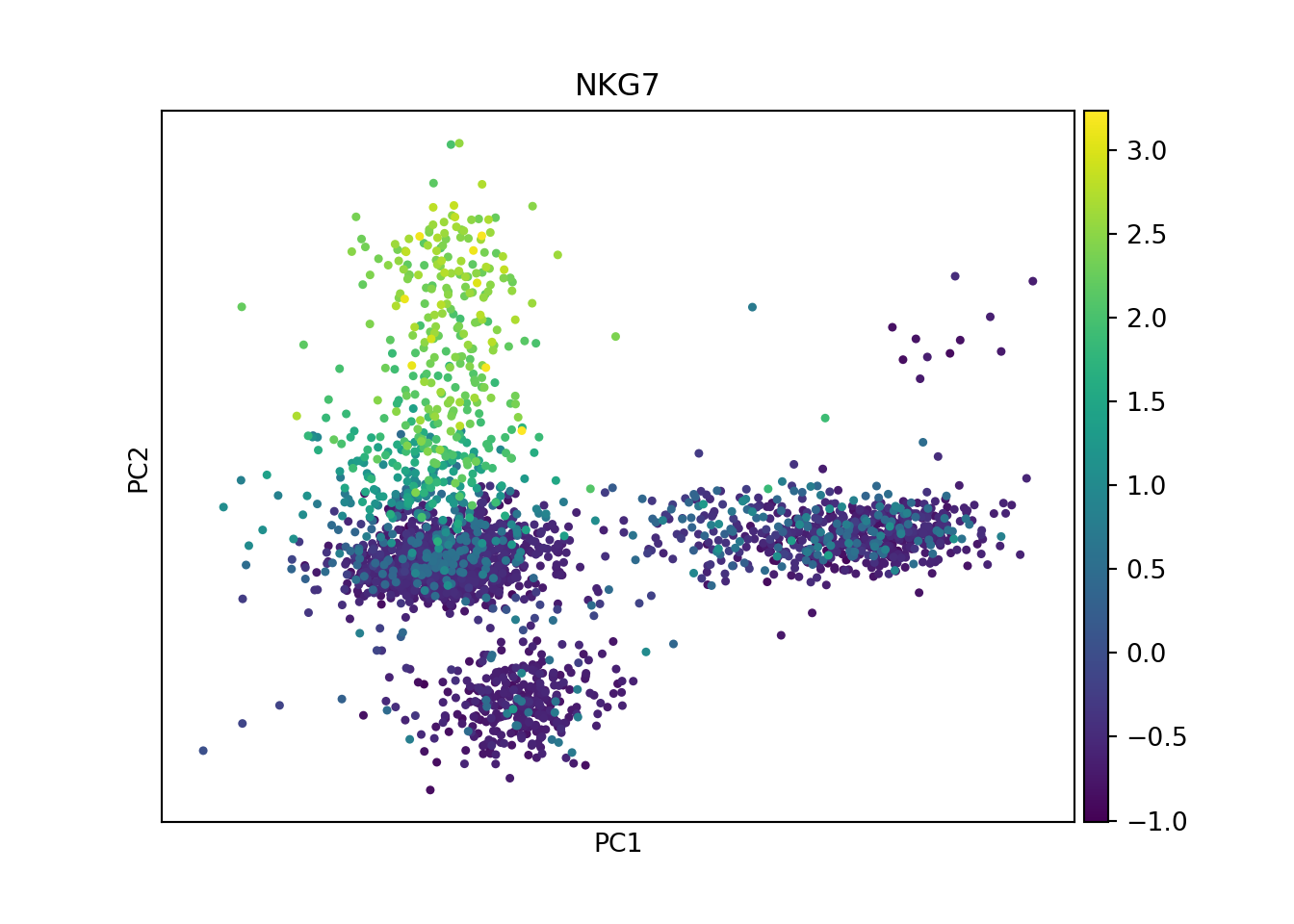
Next I perform PCA (a linear dimensional reduction) on the scaled data. This reveals the main axes of variation.
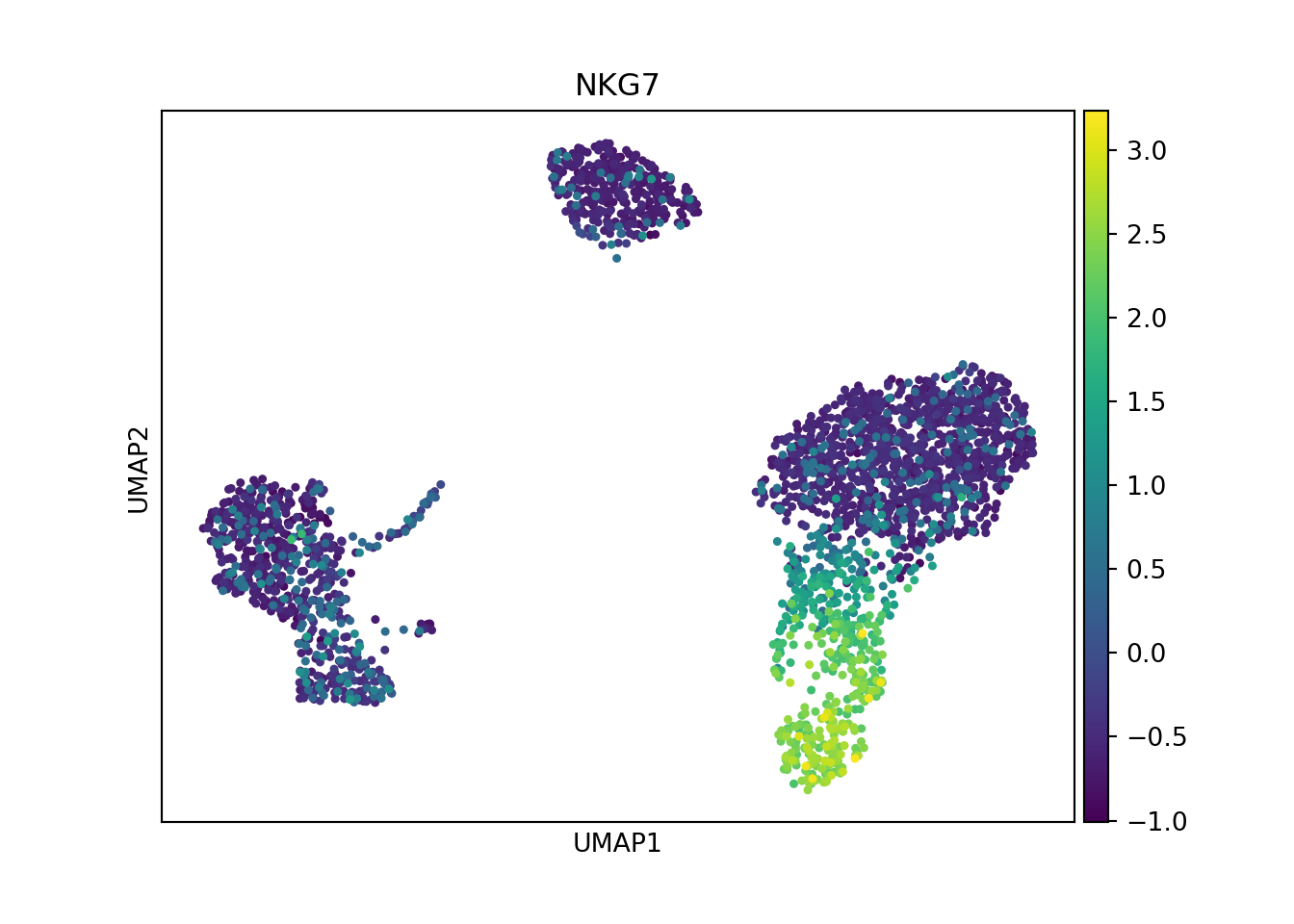
sc.tl.pca(pbmc)
sc.pl.pca(pbmc, color='NKG7') # coloring expression of a given gene
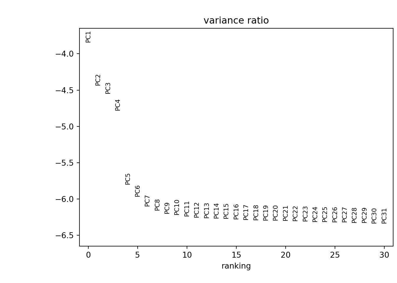
I can examine the dimensionality of the data by generating an ‘Elbow plot’. This essentially ranks the principle components based on the percentage of variance each explains. Since the ‘elbow’ occurs around 8 - 10, this suggests that the first 10 PCs capture the majority of the true signal.
# Determining dimensionality
sc.pl.pca_variance_ratio(pbmc, log=True)
Dimensional Reduction: UMAP
Alternatively, I can visualize the data using a non-linear dimensional reduction technique. In this step I compute the neighborhood graph using the PCA representation of the data. I then embed the graph in two dimensions using UMAP. If preferred, a tSNE representation can also be generated using scanpy
sc.pp.neighbors(pbmc, n_pcs=10)
sc.tl.umap(pbmc)
sc.pl.umap(pbmc, color = 'NKG7')
Clustering
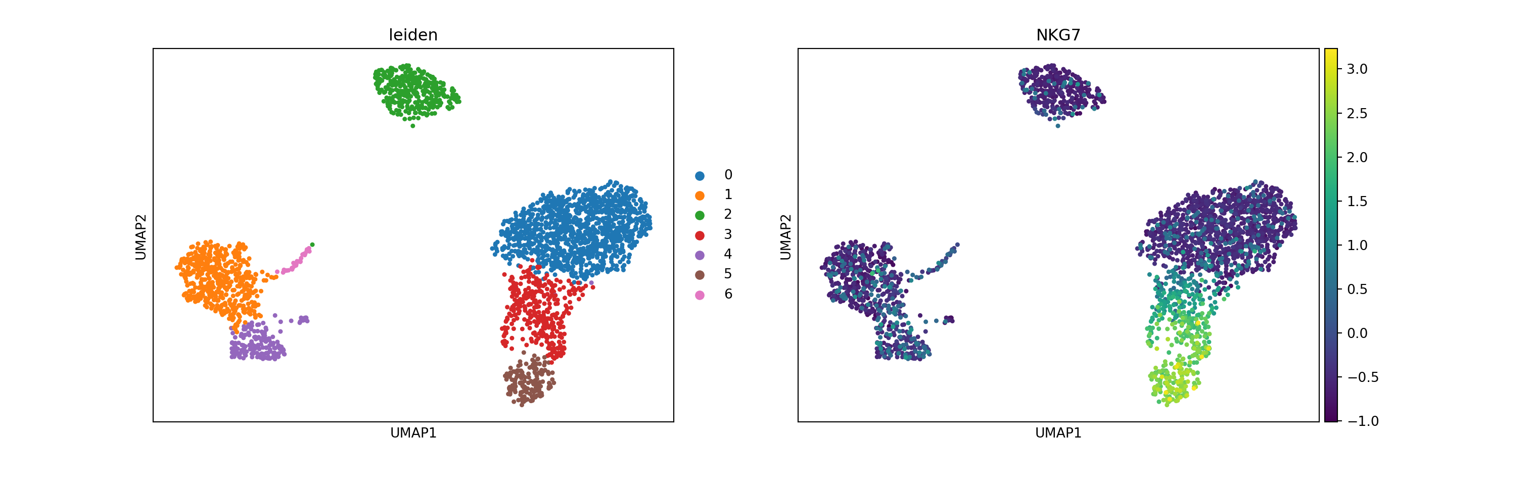
To cluster the cells, I use the Leiden graph-clustering method. This will directly cluster the neighborhood graph of cells computed above.
sc.tl.leiden(pbmc, resolution = 0.3) # resolution influences the number of clusters identified
sc.pl.umap(pbmc, color = ['leiden', 'NKG7'])
Assign cell identities
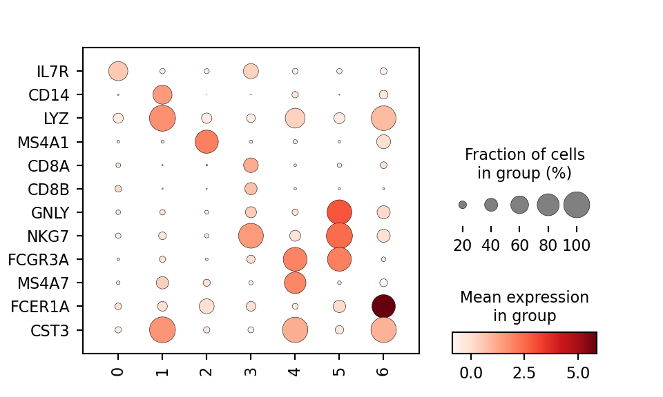
Now that the data are clustered, the natural next step is to identify the cell type each leiden cluster best corresponds to. This is often done using biomarkers. The function scanpy.tl.rank_genes_groups() will compute a ranking for the highly differential genes in each cluster. Of course there are more robust packages for performing differential testing (like MAST, limma, DESeq2) but this simple method is sufficient for identifying expression patterns of known marker genes. To simplify this process, I will use the list of known markers and their associated groups below:

I can define this list of marker genes and check to see if they are identified as differentially expressed in any clusters using a dotplot visualization.
marker_genes = ['IL7R', 'CD14', 'LYZ', 'MS4A1', 'CD8A', 'CD8B',
                'GNLY', 'NKG7', 'FCGR3A', 'MS4A7', 'FCER1A', 'CST3']
sc.pl.dotplot(pbmc, marker_genes, groupby = 'leiden', figsize = (5,3), swap_axes = True)
Finally, I can mark the cell types in the AnnData object and replot.
new_cluster_names = [
    'CD4 T',
    'CD14+ Monocytes',
    'B cells', 'CD8 T cells',
    'FCGR3A+ Monocytes',
    'NK cells', 'Dendritic Cells']
pbmc.rename_categories('leiden', new_cluster_names)
## /Users/joy/miniconda3/lib/python3.9/site-packages/pandas/core/arrays/categorical.py:2630: FutureWarning: The `inplace` parameter in pandas.Categorical.rename_categories is deprecated and will be removed in a future version. Removing unused categories will always return a new Categorical object.
##   res = method(*args, **kwargs)
pbmc.obs['clusters'] = pbmc.obs.leiden
sc.pl.umap(pbmc, color='clusters', legend_loc='on data')
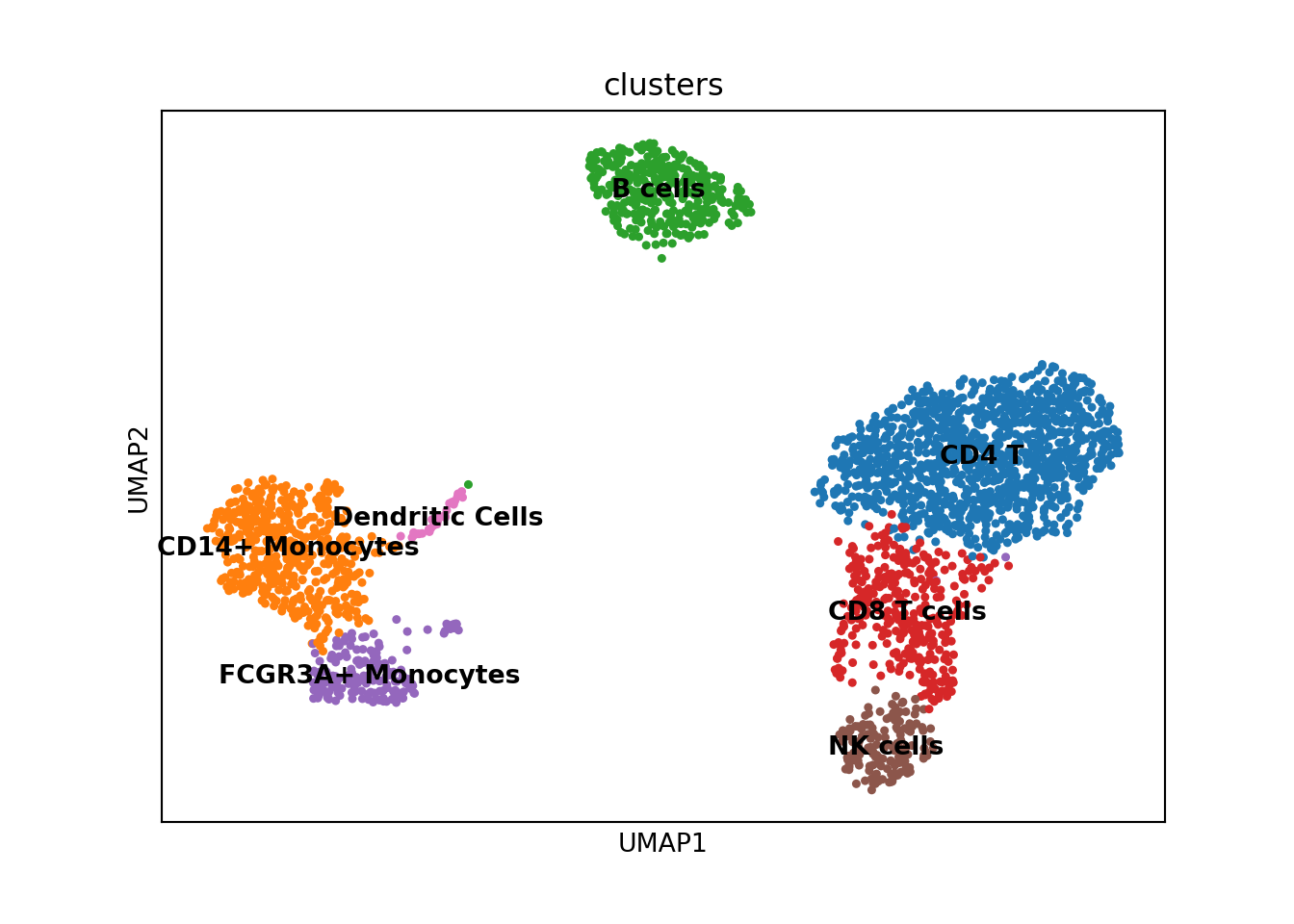
And there we have it! I’ve illustrated how scanpy can be used to handle single-cell RNA-seq data in python. For a thorough walkthrough of the many functions available in scanpy, I would recommend checking out the well documented Tutorials available. In my next post I will do this exact analysis using the Seurat package in R.
Stay tuned!